TABLEKAST • CASE STUDY
Rethinking Vision Wellness
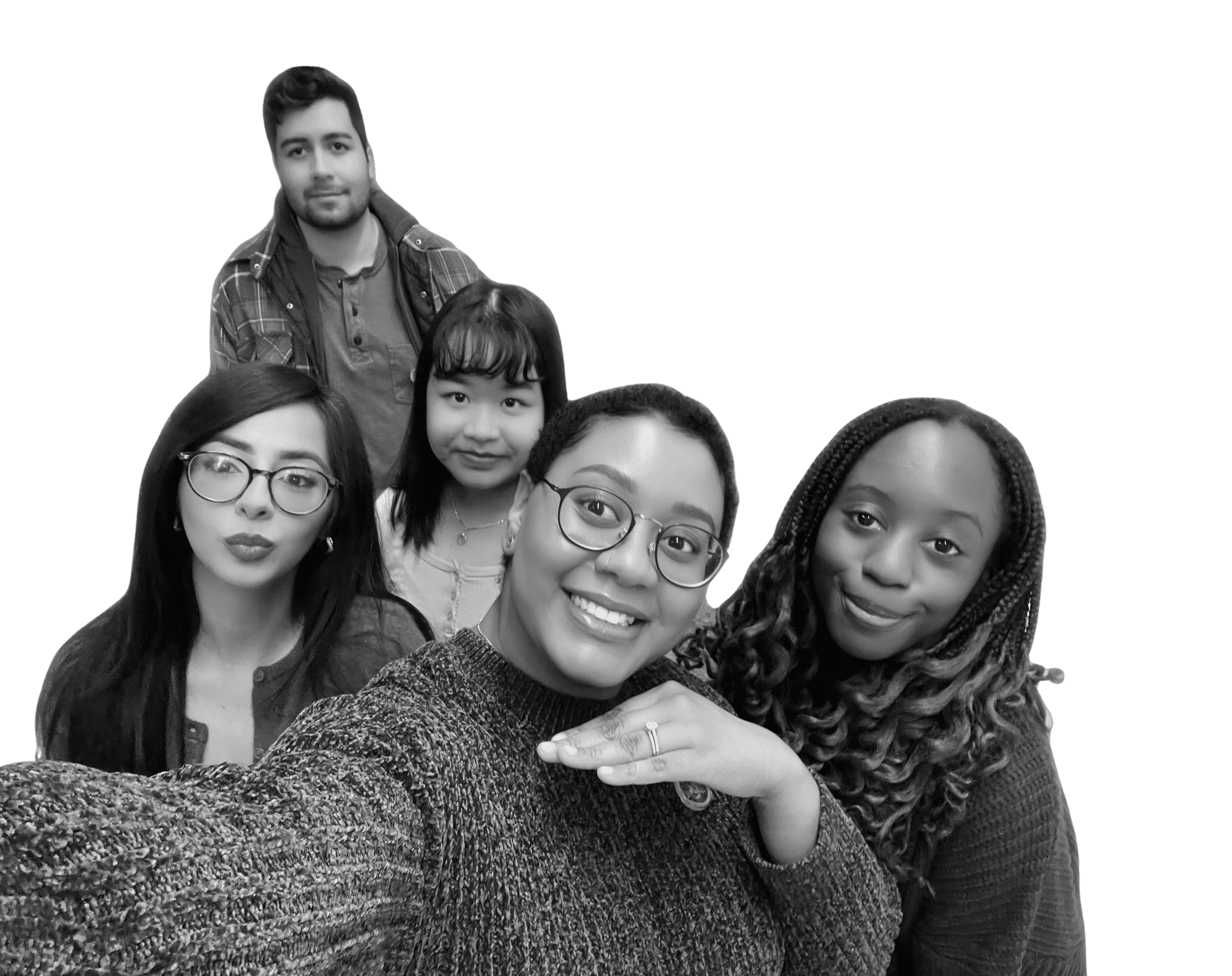
TEAM
2 Designers
1 PM
2 UX
ROLE
Product Manager
User Researcher
TIMELINE
4 Months
SKILLS
Design Thinking
Product Strategy
OVERVIEW
What should Alcon build to promote healthier vision habits for Gen Z?
Context
This 16-week collaborative project between The University of Texas at Dallas and Alcon explored Generation Z's attitudes and behaviors toward eye health.
Challenge
Alcon tasked us with understanding Generation Z's attitudes toward eye wellness and developing solutions addressing their specific needs.
Solution
Our team created TableKast— a conceptual device that reduces digital overload and promotes healthier eye habits by cutting down on screen related eye strain.
OUR PROCESS
We applied a user-centered product strategy across discovery, definition, ideation, and delivery.
RESEARCH
We needed to get inside Generation Z's heads—what do they actually know and care about when it comes to eye health?
We reviewed existing research—academic journals, medical publications, and industry reports—to understand eye care trends among Generation Z.
Next, we wanted to hear from directly from Generation Z.
To understand Generation Z's perspective on eye health, we surveyed and interviewed participants about their knowledge, habits, barriers, and attitudes.
We cast a wide net to reach our target audience.
The survey was shared through social media, personal networks, and on-campus outreach, collecting 204 responses.
We conducted interviews to hear real experiences beyond the data.
We interviewed 11 Generation Z participants through a structured process of crafting questions, developing consent forms, and conducting interviews.
RESEARCH FINDINGS
Our research highlighted key obstacles faced by Generation Z and their vision.
Through research, surveys , and interviews, we identified three critical factors driving the decline in eye health among young adults.
Problem 01.
Myopia Surge
Myopia has risen 59% among U.S. teenagers, indicating a troubling trend likely driven by modern lifestyle factors.
Problem 02.
Problem 03.
Lack of Natural Light
Generation Z spends less time in sunlight. This can lead to eye fatigue, dryness, and risk of long-term problems.
Problem 04.
Extended Screen Usage
Generation Z spends more time on screens than past generations, causing eye strain and increasing myopia risk.
Interviews revealed many of these obstacles, particularly concerning screen time.
Below are some quotes from our interviewees.
"I spend hours staring at a screen every day and sometimes get headaches. I want something that eases eye strain so I can work or study without getting headaches."

"As someone who spends a lot of time on digital devices, I want a way to protect my eyes so that I can continue using my devices safely and comfortably."
With these insights revealed, the question became: what should we build?
To answer this question, we began by identifying the key objectives our solution needed to meet.
DESIGN GOALS
Generation Z faces growing eye strain from prolonged screen use and needs an innovative solution that safeguards eye health and encourages healthier habits.
To address this challenge uncovered from our research, we identified three recurring pain points and turned each into a design question to solve.
Eye Strain
How can we help reduce eye strain and protect vision during long periods of screen usage?
App Overload
How can eyecare be encouraged without adding more apps or digital distractions?
Convenience
How can we make eye care easy, convenient, and seamlessly fit into daily routines?
EXPLORING SOLUTIONS
With the problem defined and our goals in mind, we began exploring a wide range of ideas and possibilities.
Here are some of the ideas we considered.

Tracking Tool
Keep track of vision changes and habits to stay proactive about eye health.

Smart Glasses
Monitor vision health throughout the day and provide actionable insights.

Adaptive Lighting
Automatically adjust lighting to maintain optimal conditions for healthy eyes.
Projections Device
Project screens onto surfaces to reduce blue light exposure and reduce strain.

Screen Overlays
Customize displays to improve clarity, comfort, and support long-term eye health.

Home Test
Quick and convenient vision checks from home to catch changes early.
In the end we decided to design a projection device as our final solution — but why was this solution chosen over the others?
To determine the right solution we revisited our design goals —here is how a projection device could meet all three objectives.
Eye Strain
Reduce eye strain and protect vision by using projection to make viewing easier and limit harmful screen exposure.
App Overload
Promote eye care through a physical device that reduces digital distractions.
Convenience
The device will be portable offering convenience, and should integrates seamlessly into daily routines for work, study, and leisure.
DESIGN REQUIREMENTS
We developed a comprehensive Product Requirements Document to define the product's core features and functionality.
The PRD outlined features across display systems, interaction methods, and physical design. Below are the key components and functions of each system.
Convex Lens
Adjustable Legs
Resizable to match any device.

Kickstand
Supports device without the base for larger devices.

Rotation Dial
Adjust viewing angle.

Interactive Pen
Touchless screen interaction.

Detachable Clicker
Detaches for independence usage.

Bluetooth Connection
Provides wireless interaction.

Interchangable Tips
For customized input.

DEVELOPMENT
Next, we translated finalized features into visual designs.
Grounded in the PRD, we collaboratively explored concepts to find the best direction, moving from sketches to 3D renderings to refine the design’s look and feel.
We used FigJam to collaborate on our ideas.
Through this collaborative exploration, the team refined our direction and aligned behind a unified final concept.
Primary Module and Base
The final design uses a convex lens to magnify or project content from phones, tablets, and laptops, with an adjustable stand, detachable kickstand, and flexible angle control.
Bluetooth Stylus with Detachable Clicker
FINAL SOLUTION
We developed high-fidelity prototypes to refine our concepts and decided on the name TableKast—reflecting the product's casting functionality.
The following walkthrough demonstrates how users interact with TableKast.

Module with Base
TableKast is an all-in-one device designed to reduce eye strain from prolonged screen exposure.
It functions as both a magnifier and projector, allowing users to enlarge or project their device's display onto a surface, limiting blue light impact and enabling more comfortable extended screen usage.

Detachable Standalone
TableKast can be separated by detaching the front mount that holds the convex glass from the main base, transforming it into a kickstand that allows the device to stand independently for larger devices.
It has adjustable legs with secure latches, making it easy to change the height to suit different setups and preferences.

Adjustable Lens
The convex lens can be tilted backward for Magnifying Mode or forward for Projection Mode, allowing users to select the viewing setup that best suits their needs.
There are rotational dials on the legs that provide smooth control over the lens angle, making it easy to switch between modes.

Interactive Pen
TableKast includes a Bluetooth-enabled pen that connects directly to the user's device for writing, scrolling, and zooming.
The pen features replaceable tips and a detachable clicker for control without holding the pen.

Detachable Clicker
The clicker attaches to the pen's top where the power button is located, enabling control without holding the pen.
When detached, it functions independently with up/down navigation buttons, a central selection button, and a side zoom slider.
MEASURING SUCCESS
With the product design finalized, we outlined how we would measure TableKast's impact and success if brought to market.
To evaluate TableKast's performance against our design goals, we identified several key metrics.

Sales Revenue
Adoption rate, product performance, and return on investment.
Customer Engagement
Frequency of use and feature preference between projection and magnification modes.

Goal Achievement
Aligned with eye strain reduction, healthier screen habits, and seamless integration.

User Feedback
Satisfaction, ease of use, and perceived changes in eye comfort and screen habits.

Health Outcomes
Self-reported reductions in digital eye strain and related symptoms over time.

Retention Rate
Monitor whether users continue using TableKast over time, indicating lasting adoption.
We also defined how success would be measured for Alcon beyond just product sales.

Brand Recognition
Increased awareness among Generation Z, positioning Alcon as innovative in digital wellness.


PROJECT REFLECTION
This 16-week journey provided insights that will shape how I approach future design challenges.
Here's what I learned along the way.
Invest in research upfront.
Understanding users deeply before designing saves time and creates better outcomes. Research isn't a formality but the foundation of meaningful work.
Embrace constraints as opportunities.
Limitations force sharper thinking and more innovative solutions. Learning to work within constraints has made me a stronger designer.
Build collaborative processes.
Intentional collaboration structures and shared tools amplify team creativity. Great teamwork requires planning, not just goodwill.
OPEN OPPORTUNITIES
There were some opportunities to enhance the project that weren’t fully explored due to time.
Testing
Conduct additional user testing to gather actionable feedback and identify usability pain points earlier in the design process.
Development
Develop higher-fidelity, interactive prototypes to better simulate real-world usage and validate design decisions.
Instructions
Allocate more time to refining user instructions and tutorials to improve onboarding and ensure clarity for first-time users.