HEALTH HAVEN • CASE STUDY
Empowering Medication Management
TEAM
Harmony Pena
Shraddha Patel
Joshua Perez
Vishnu Pandey
ROLE
Product
UI Designer
User Researcher
TIMELINE
2 Months
SKILLS
User Research
User Testing
UI Design
OVERVIEW
What if forgetting your medication was no longer an option?
Challenge
Understanding how people manage their medications day to day — and why so many struggle to stay consistent, informed, and confident in their own healthcare routines.
Solution
A personalized health companion with dose tracking, reminders, medication interaction checks, and virtual healthcare support.
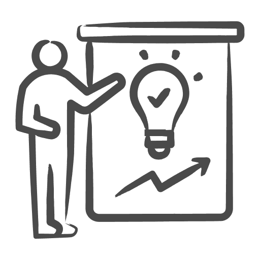
OUR PROCESS
We followed a flexable UX process from discovery to delivery.

NEEDFINDING
Tasked with improving personal healthcare, we started with people — not assumptions.
We set out to understand how people manage their health day to day — observing and interviewing real users in their natural environments before drawing any conclusions.
4+
People Observed & Interviewed
Each team member observed and interviewed real participants to uncover the challenges people face managing their health day to day.
1
Recurring Problem
Across every observation and interview, one theme stood out, people struggling to manage their medications consistently day to day.
3
Core Issues
Three pain points emerged from our research — forgotten doses, lack of medication information, and no reliable system for consistent adherence.
The research was clear — four problems needed solving.
Across every observation and interview, the same pain points consistently emerged, defining the core problems we set out to solve.
Problem 01.

Forgetting Doses
Without a reliable system to confirm doses, users risk double-dosing or skipping entirely.
Problem 02.

Lack of Information
People don't have easy access to side effect data or drug interaction warnings in one place.
Problem 03.
No Personalized Reminders
Generic phone alarms don't account for changing schedules, refill timing, or patterns in missed doses.
Problem 04.

Limited Access to Guidance
Getting quick, reliable healthcare advice is rarely easy. Users need accessible, real-time support.
STORYBOARDS
We visualized the problem before we designed the solution — mapping out real user scenarios to define what to build and why.
Using our research findings, we created storyboards around the users most affected — visualizing how a solution could fit into their real lives and aligning the team on what to build.
65 · Retired · Managing Daily Medications
Sophia
PROBLEM
Atleast once a day Sophia stares at her pill bottle wondering — did I already take that? With no way to check, she risks double-dosing or skipping entirely.
DISCOVERY
Her dose tracker says 8:14 AM — taken.

RESOLUTION
Mystery solved. She gets on with her morning — no stress, no second guessing.
45 · Busy Professional · Multiple Prescriptions
Hector
PROBLEM
Hector's back-to-back meetings mean his midday dose keeps getting skipped. He also has medication questions but can never get a quick answer from his doctor.
DISCOVERY
He sets a reminder around his schedule. The virtual pharmacist assistant checks for interactions — all clear.
RESOLUTION
No more missed doses, no more unanswered questions — no waiting rooms, no phone tag.
PROTOTYPE AND KEY FEATURES
We translated user needs into a fully navigable prototype.
Each feature was grounded in a user need uncovered during needfinding — giving every design decision a clear purpose and direction.
Medication Reminders
Customizable reminders built around the user's actual schedule — not a fixed time that ignores how their day works.
Dose Tracker
A full history of medication intake that lets users confirm whether a dose was taken and review their records at any time.
Medication Info & Interactions
Search any medication to learn about dosage guidelines, side effects, and potential interactions with other medications — all in one place.
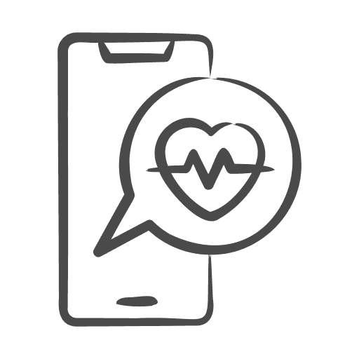
Virtual Pharmacist Assistance
Video call a licensed pharmacist directly from the app for real-time guidance — no appointment, no waiting room.
HEURISTIC EVALUATION
Evaluating our prototype through usability testing.
Users tested our prototype and identified a range of issues. These are the top 3 that came up consistently across multiple users — each rated by severity and actioned accordingly.
Missing Accessibility Options
The initial prototype had no accessibility options — features like VoiceOver, Zoom, and increased contrast were missing, making the app difficult to use for users with disabilities.
High Priority · Addressed
No In-App Feedback or Rating Prompt
There was no way for users to report issues or provide feedback from within the app — a small but useful addition for improving the product over time.
High Priority · Addressed
VIDEO PITCH
We brought Health Haven to life through a 5-minute video pitch.
The final deliverable was a 5-minute video pitch showcasing the app in use — designed to make the case for why HealthHaven deserves to be built.
PROJECT REFLECTION
What I learned, and what I'd do differently.
Here's what I learned along the way.
As a Designer
Starting with research made every design decision easier to defend — we could always point back to something a real user said.
As a Product Manager
Managing six deadlines across eight weeks taught me how to prioritize under pressure — and that the hardest decisions are often about what not to do.
What I'd Change
There were some opportunities to enhance the project that weren't fully explored due to time. A second round of usability testing after fixes and higher-fidelity storyboards earlier in the process would have made a meaningful difference.